How to Create a Cottagecore Gallery Wall (With Printable Art That Actually Looks Handmade)
- Azalia

- Apr 20
- 5 min read
You've seen it a hundred times on Pinterest: that dreamy bedroom wall layered with botanical prints, soft cream frames, a pressed-flower watercolor, something that looks almost like an old embroidery sampler your grandmother might have made. It feels collected. Lived-in. Like it grew there slowly instead of being ordered all at once.
Here's the secret most styling posts don't tell you: that look is entirely achievable with digital printables — if you choose the right ones. Not the clean modern minimalism you'll find at most print shops, but art that carries actual texture. Stitched edges. Linen backgrounds. Faux needlework that makes you want to reach out and touch the screen.
This post is your guide to curating a cottagecore gallery wall that feels genuinely handmade — from choosing the right art to framing it, sizing it, and arranging it in a way that tells a story. Let's begin.
What Makes a Gallery Wall Feel "Cottagecore" (and Not Just Cluttered)
The word "cottagecore" gets used loosely, but when it applies to a gallery wall, it means something specific: an aesthetic of warmth, nature, and nostalgic craft. Think botanicals. Wildflowers. Handwritten script. The feeling of a slow Sunday morning and a cup of tea you let steep too long.
What separates a cottagecore gallery wall from a random collection of frames is cohesion of feeling. You don't need everything to match — in fact, you shouldn't — but every piece should belong to the same emotional world. Soft palettes. Organic forms. A sense of something made by hand, even if it wasn't.
This is where embroidery-style printable art becomes the cottagecore collector's best tool. When the art itself mimics the texture of stitched linen, frayed fabric edges, or cross-stitch patterns, it brings that handmade warmth into a digital print. You're not just hanging paper on a wall — you're hanging a feeling.
Start With an Anchor Piece
Every gallery wall needs an anchor — one larger, more visually complex piece that everything else is arranged around. For a cottagecore wall, this is usually your most textured or statement-making print. A full bouquet of wildflowers. A botanical study with layered details. Something with presence.
When choosing your anchor, think about it as the "oldest" thing on the wall — the piece that could believably have come from an antique market or been passed down through a family. Faux-embroidered floral arrangements, vintage botanical prints with linen-texture backgrounds, or a framed needlework-style illustration all carry this quality.
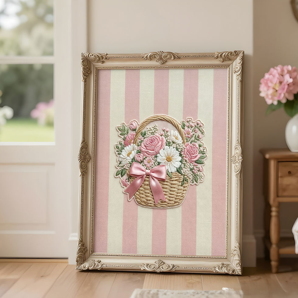
Embroidery-Style Floral Bouquet Printable by Luxy Vibes
Layer Sizes — But Think in Pairs, Not in Chaos
The classic gallery wall advice — "mix your sizes!" — is correct but incomplete. The trick is to layer sizes in a way that still feels considered. A good rule: anchor large (16x20 or 18x24), support medium (8x10 or 11x14), and accent small (4x6 or 5x7). The rhythm of big, medium, small repeated across the arrangement creates visual movement without randomness.
Most quality printable art shops offer multiple aspect ratios in each listing so you can choose the size that fits your space. At Luxy Vibes, every printable comes with five resizable aspect ratio files, so you can print your anchor at 18x24 and pull a matching medium and small from the same collection for a built-in cohesive look — no hunting required.

Vintage Wildflower Botanical Print Set by Luxy Vibes
Frames: When to Match, When to Mix
This is where most gallery walls succeed or fail. The framing choices are as important as the art itself.
For a cottagecore aesthetic, you have two elegant directions: unified warmth (all frames in the same warm wood tone or cream finish, which creates a serene, curated feel) or intentional mismatch (slightly different wood finishes and frame styles that feel collected over time, like each piece came from somewhere different). Both are beautiful. The one thing to avoid: a cold metal or stark black frame in an otherwise warm arrangement. It will read as an error, not as contrast.
Thrifted frames, IKEA Ribba in natural, simple oak from Amazon — all work beautifully with embroidery-style prints because the warmth of the art grounds the frame rather than competing with it. If the art carries the texture, the frame just needs to hold it.
The Arrangement: Map It Before You Hammer
Arranging a gallery wall is part intuition, part math. Before a single nail goes in, lay everything out on the floor in front of the wall. Photograph it from above. Live with the arrangement for a day if you can.
For a cottagecore wall, lean toward an organic, slightly asymmetrical arrangement rather than a rigid grid. A structured grid feels modern. An organic grouping — a little taller on one side, a little denser in the center — feels like it grew there. Start with your anchor piece slightly left or right of true center, then build outward with your medium and small pieces.
Leave more breathing room than you think you need. Cottagecore is not maximalist — it's layered but not crowded. Each piece should be able to breathe.
What to Print On (And Where)
For cottagecore printable art, the paper you choose matters enormously. Standard bright-white photo paper will strip the warmth from even the most carefully designed print. Instead, look for:
Matte fine art paper — absorbs light softly, makes colors feel rich and antique-toned. Best for embroidery-style and botanical prints.
Linen-texture cardstock — if your local print shop offers it, this makes a faux-embroidery printable look almost like the real thing.
Warm white matte paper — a warmer base tone than standard photo paper, and much more sympathetic to cream, floral, and vintage palettes.
Walgreens, Costco, and Staples all print at good quality for everyday art. For a special piece — your anchor, especially — a local print shop or an online fine art printer like Printful or Mpix is worth the slightly higher cost.
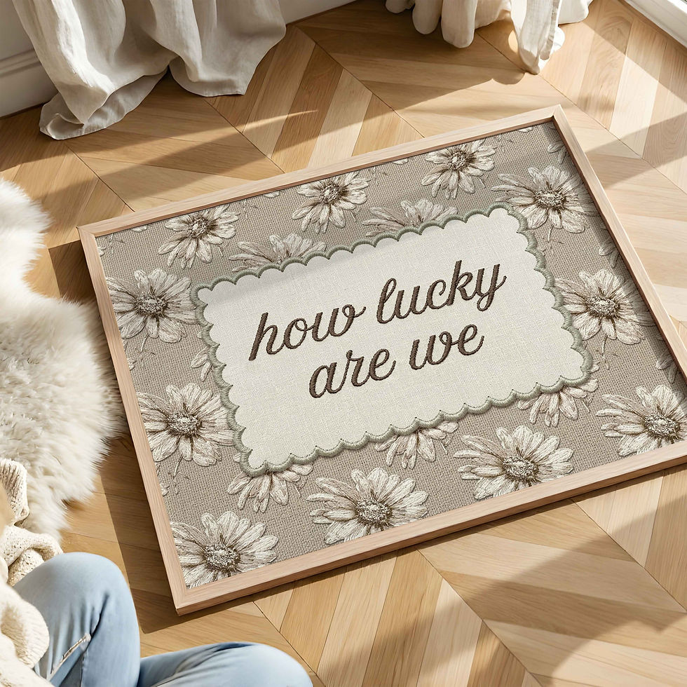
Scalloped Border Floral Printable by Luxy Vibes
Adding Meaning: Mix in Personal and Seasonal Pieces
The most beautiful gallery walls aren't just pretty — they mean something. For a cottagecore aesthetic, this might look like weaving a pressed-flower frame alongside your botanical prints, or including a vintage scripture or poem among the florals. A grandmillennial gallery wall often holds a cross-stitch sampler or embroidery hoop alongside framed prints — and a faux-embroidery printable fills that role beautifully for those of us who love the look but not the 40 hours of actual stitching.
If your home has a faith dimension, a bible verse printable in embroidery-style lettering brings both meaning and visual warmth to a gallery wall — and fits seamlessly alongside florals and botanicals without feeling out of place.
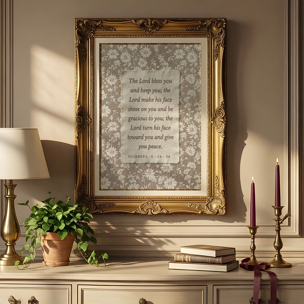
Scripture Embroidery-Style Printable by Luxy Vibes
The Finishing Touches That Make It Feel Collected
Once your frames are hung, a few small details take a gallery wall from "I just decorated" to "this has always been here":
A small dried flower arrangement or a botanical sprig tucked into the frame of one piece. A vintage book or object placed on a ledge shelf below. A single trailing piece of dried eucalyptus draped from a small hook. These physical textures echo the embroidered and botanical art behind them, and they create a sense that the wall is part of the room's living personality — not just decoration applied to a surface.
A gallery wall is never really finished — and that's the point. It's a wall that grows with you, one frame at a time. Start with one piece that makes your heart stop just a little, and the rest will follow. Browse the Luxy Vibes vintage and cottagecore collection and find the one that starts it all.


Comments